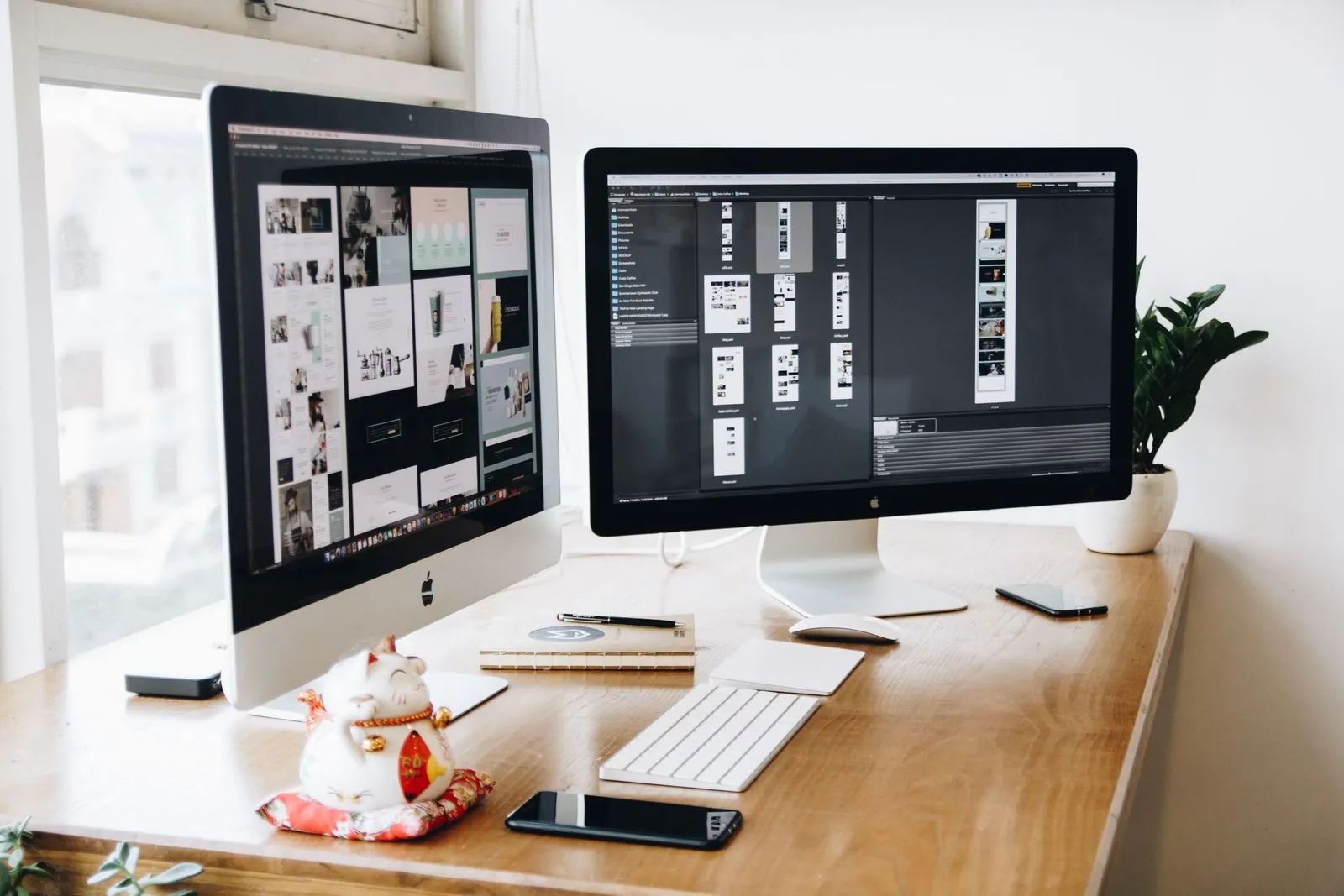
It is easy to fall in love with a beautiful website and forget what it is for. For most businesses the job of the site is simple: help the right visitor understand what you do and take one clear next step. Everything else is in service of that.
One primary action per page
Every page should have a single, obvious thing you want the visitor to do — book a call, view work, send an enquiry. When a page offers five equally weighted options, people tend to pick none. Decide the priority action, make it visually louder than everything else, and repeat it as the visitor scrolls.
Speak to the visitor, not about yourself
A common mistake is a homepage that only talks about the company. Visitors care first about their own problem. Lead with what you solve and who it is for, then back it up with proof — work, results, testimonials — before asking for anything.
- Above the fold: say what you do and for whom in one line.
- Proof next: selected work, recognisable clients, or concrete outcomes.
- Then the ask: a single, unmissable call to action.
Speed and clarity are UX
A stunning site that loads slowly on a phone loses people before they see it. Performance, legible type, generous tap targets and a layout that survives a small screen are not separate from design — they are the parts of design the visitor feels most. Get those right and the beautiful details finally get a chance to land.
If a visitor has to think about how to use your site, the design is doing the opposite of its job.