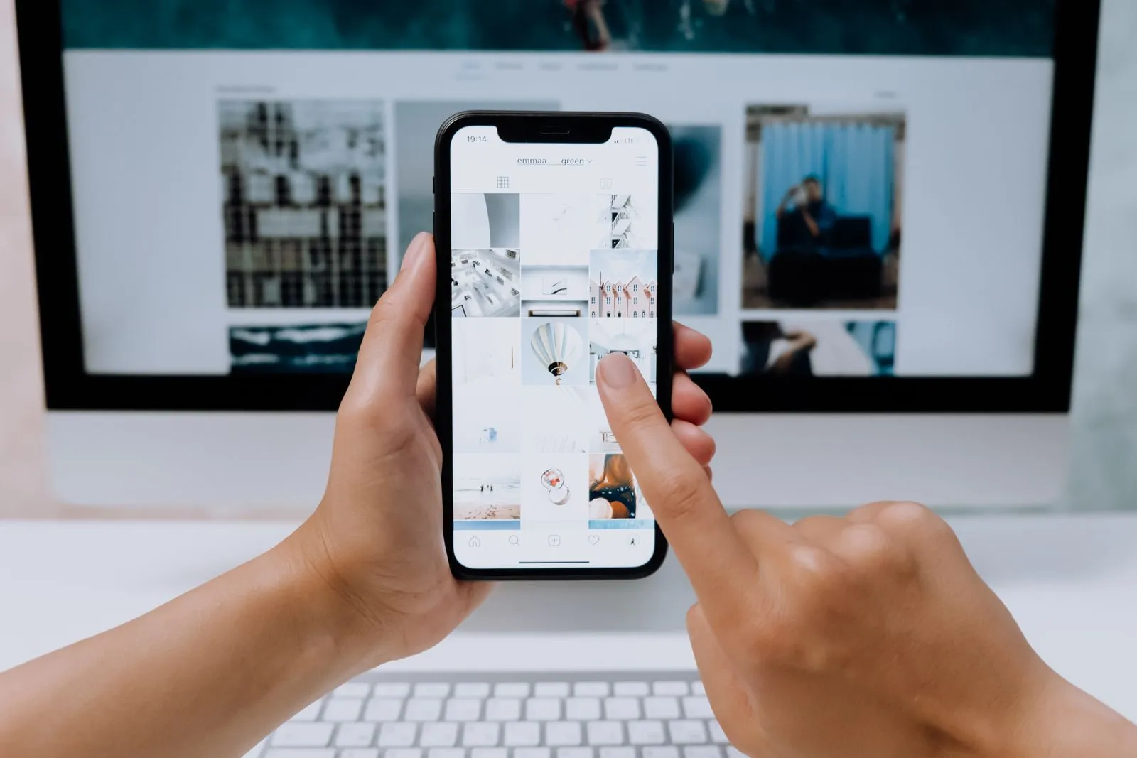
Two tabs dominate most UX and product inspiration sessions: Dribbble and Mobbin. They are not competitors so much as different lenses. Mixing them up is why moodboards look gorgeous and shipped products feel generic.
Dribbble: free, fast, community taste
Pros
- Free to browse, huge community, great for visual style, illustration and polished UI shots.
- Easy to follow creators and build a personal taste library.
Cons
- Single screens out of context — you rarely see the full flow, empty states or edge cases.
- Trend gravity — everyone references the same glassmorphism / bento / gradient week.

Mobbin: real apps, flows and motion
Pros
- Screenshots from real shipped apps, organised as flows — onboarding, paywalls, settings, search.
- Stronger for motion and micro-interactions than a static Dribbble shot.
- Better for product and UX decisions than for brand illustration.
Cons
- Paid Pro for the serious library; overkill if you only need mood.
- Less "arty" — you will not find experimental posters here.
A simple rule
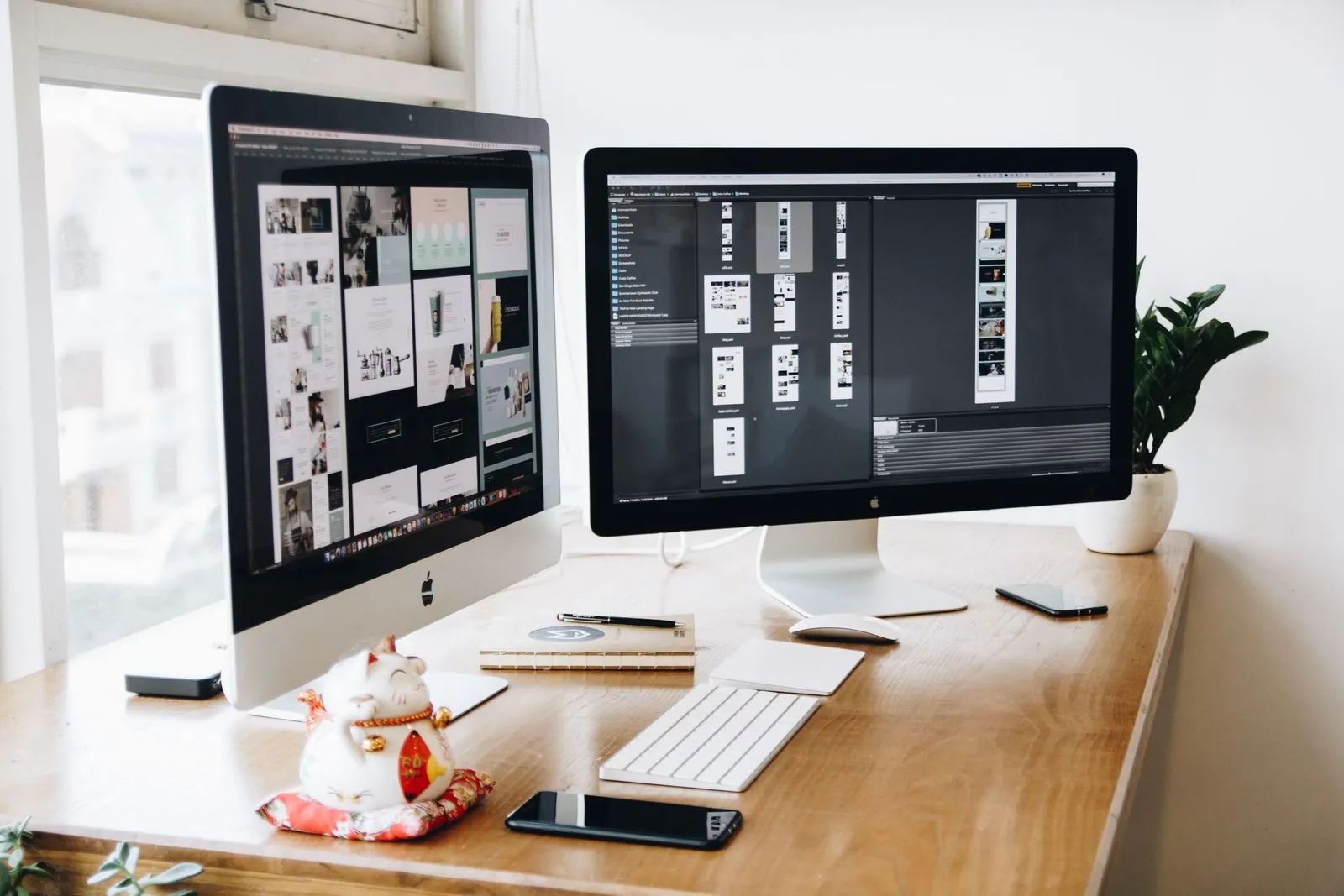
Open Dribbble for visual direction and craft references. Open Mobbin when you are designing a flow, a paywall, an empty state or a motion pattern that has to feel familiar. Most strong product teams use both — and steal structure from Mobbin more often than they admit.
Pretty screens impress stakeholders. Working flows keep users.